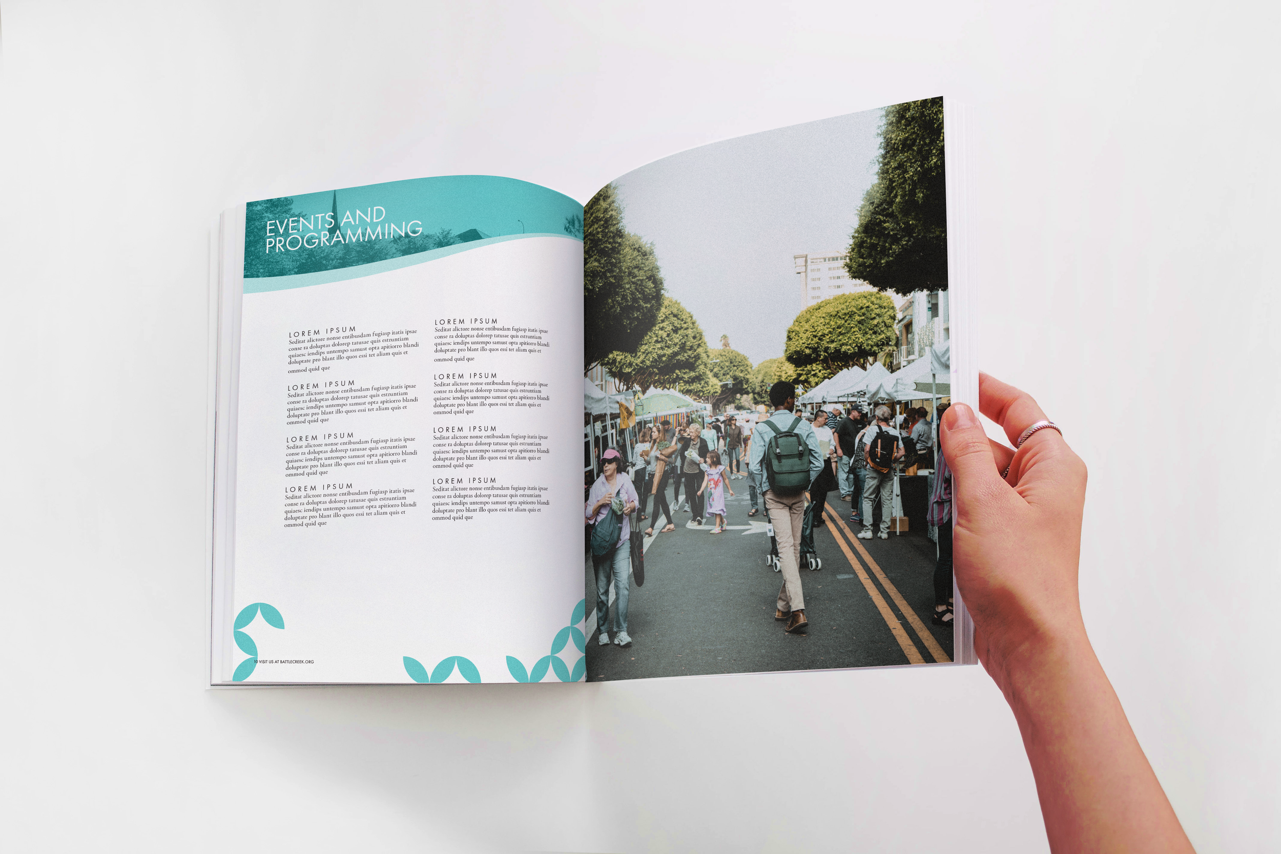
Battle Creek Area Chamber of Commerce –
Brand Development
During my internship as a graphic designer for the Battle Creek Area Chamber of Commerce, a key objective was to create a rebrand for the Chamber. The original logo, in use since 1982, no longer aligned with the Chamber's vision of driving future growth in the city's economy and commerce. This case study highlights the rebranding process, with a focus on the new logo design, its connection to Battle Creek's history, and the representation of the Chamber's core values through color choices.
To create a logo that resonated with Battle Creek, I drew inspiration from the city's history and its significance in agriculture and the cereal industry. The original logo's concept of grain, representing Battle Creek's agricultural roots, was abstracted and reimagined to form the shape of the state of Michigan. This distinctive element helped differentiate Battle Creek from other similarly named cities in the United States.
The new logo and color palette have revitalized the Chamber's brand, aligning it with its forward-thinking vision and current values. The rebrand has generated renewed interest and engagement from local businesses and community members. By representing Battle Creek's history, the logo acts as a bridge between the city's agricultural heritage and its future as a thriving hub for commerce and economic growth.


